
The Big Cheez is a nostalgic snack brand with bold flavor—but its original packaging lacked the warmth and clarity that today’s families look for. This rebrand project brings new life to The Big Cheez by creating a cohesive, family-friendly design system that speaks directly to its primary audience: parents.
the big cheez
overview
Role: Graphic Designer
Tools: Adobe Illustrator, Photoshop, Canva
Project Type: Packaging Design, Brand Identity, Visual Rebrand
What I Created:
Developed brand goals focused on parent-friendly design.
Redesigned packaging layout for clarity and shelf appeal.
Designed three unique but cohesive flavor variations.
Added custom illustrations, recipes, and customer quotes.
Highlighted family-owned and affordable values.
Integrated a scannable barcode for brand engagement.

The challenge
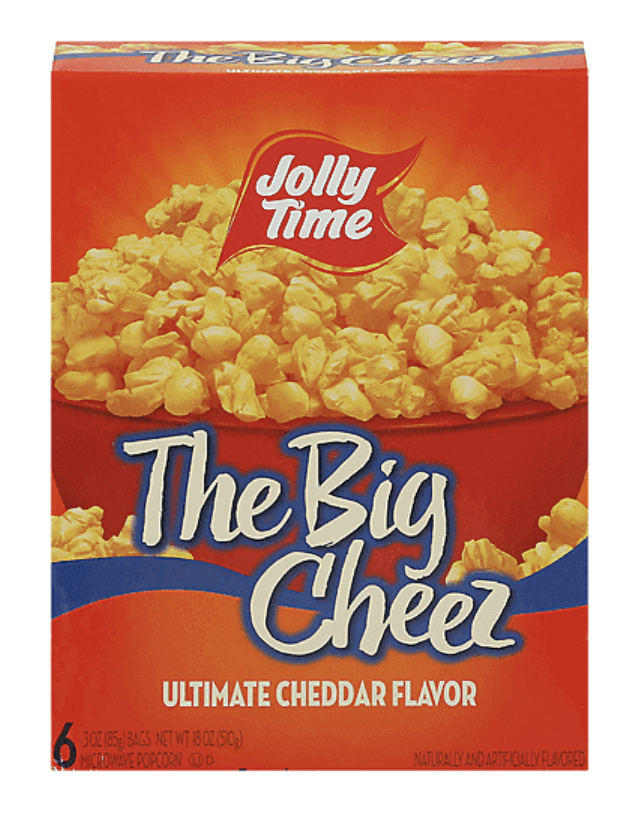
The original packaging suffered from a lack of cohesion. An overpowering red-orange palette distracted from the product name, while the mismatched font styles and disconnected elements made it difficult to read. Most importantly, it didn’t speak to the needs of its target audience—parents seeking fun, trustworthy snacks for their families.
Moodboard exploration

To bring the rebrand to life, I took inspiration from retro poster designs—elegant layouts, large serif fonts, and patterned backdrops with playful gradients.
inital designs
Each design explores a unique visual approach while staying grounded in the brand’s core values: family-friendly, affordable, and fun. Through retro inspiration, bold fonts, and vibrant palettes, these layouts were crafted to appeal directly to parents looking for a snack that feels playful but trustworthy.


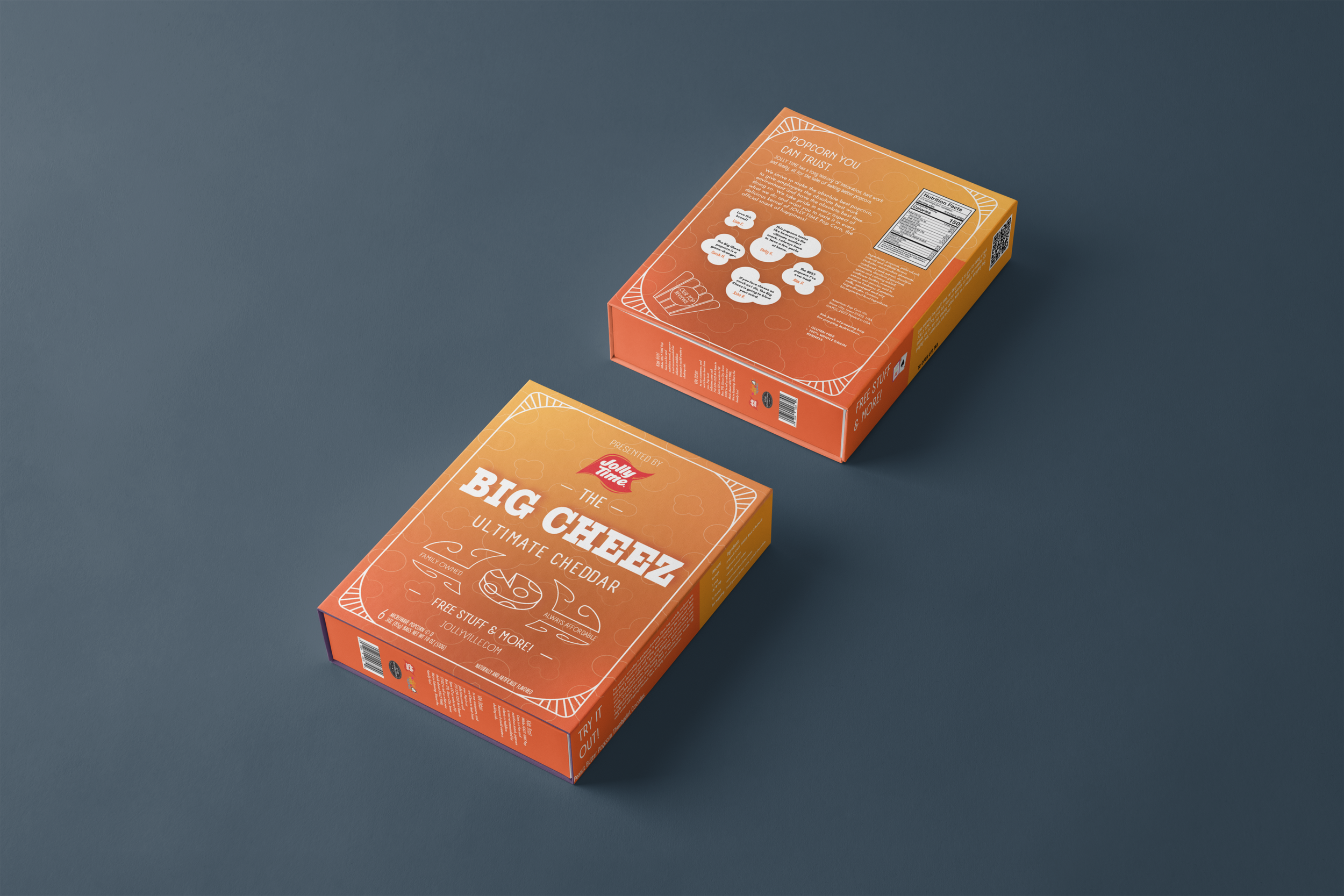
final layout
“jollytime— the official snack of happiness.”
The redesigned layout improves hierarchy, readability, and shelf appeal. On the back, I added customer quotes to build brand trust, while the side panel features a unique recipe tailored to each flavor—adding real value for families and creating a sense of discovery with each box.


flavor VARIATIONS
Each flavor got its own playful, color-driven identity while staying true to the overall brand feel:
Kettle Corn: Light and dark pink hues for a sweet, nostalgic pop
The Big Cheez: A classic yellow-orange combo for a warm, cheesy feel
Mallow Magic: Dreamy purples and blues to evoke the fun of marshmallow treats
impact
Developed a rebrand for The Big Cheez that reflects its core values: family, affordability, and fun.
Created packaging with a thoughtful user experience, targeting parents with a trustworthy, engaging, and vibrant design.
Transformed the brand into more than just a snack—positioning it as a family-friendly experience that encourages togetherness and joy.
Enhanced visual identity to connect with consumers on a deeper, emotional level.
